|
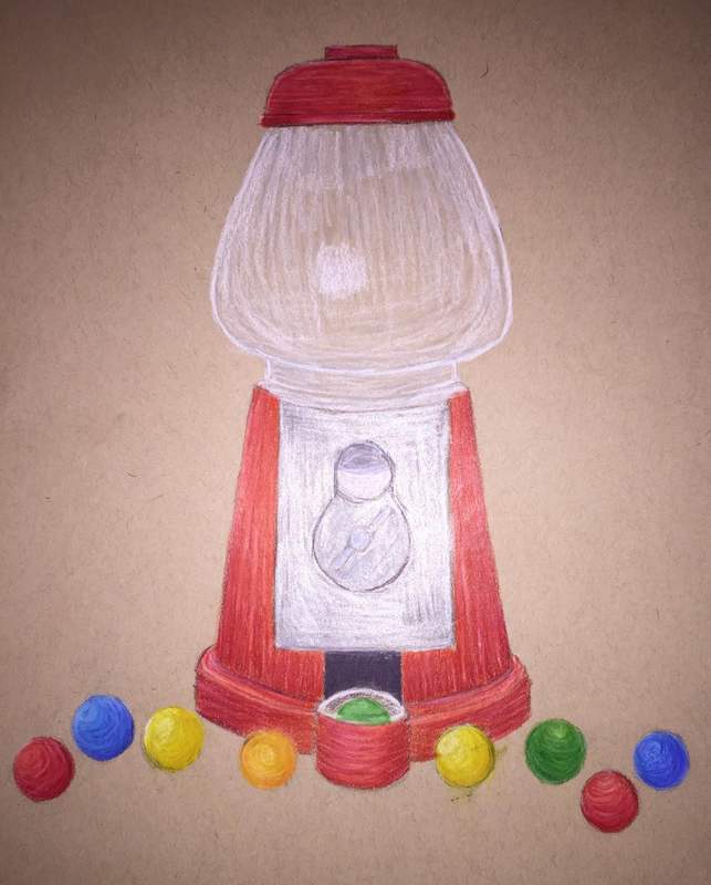
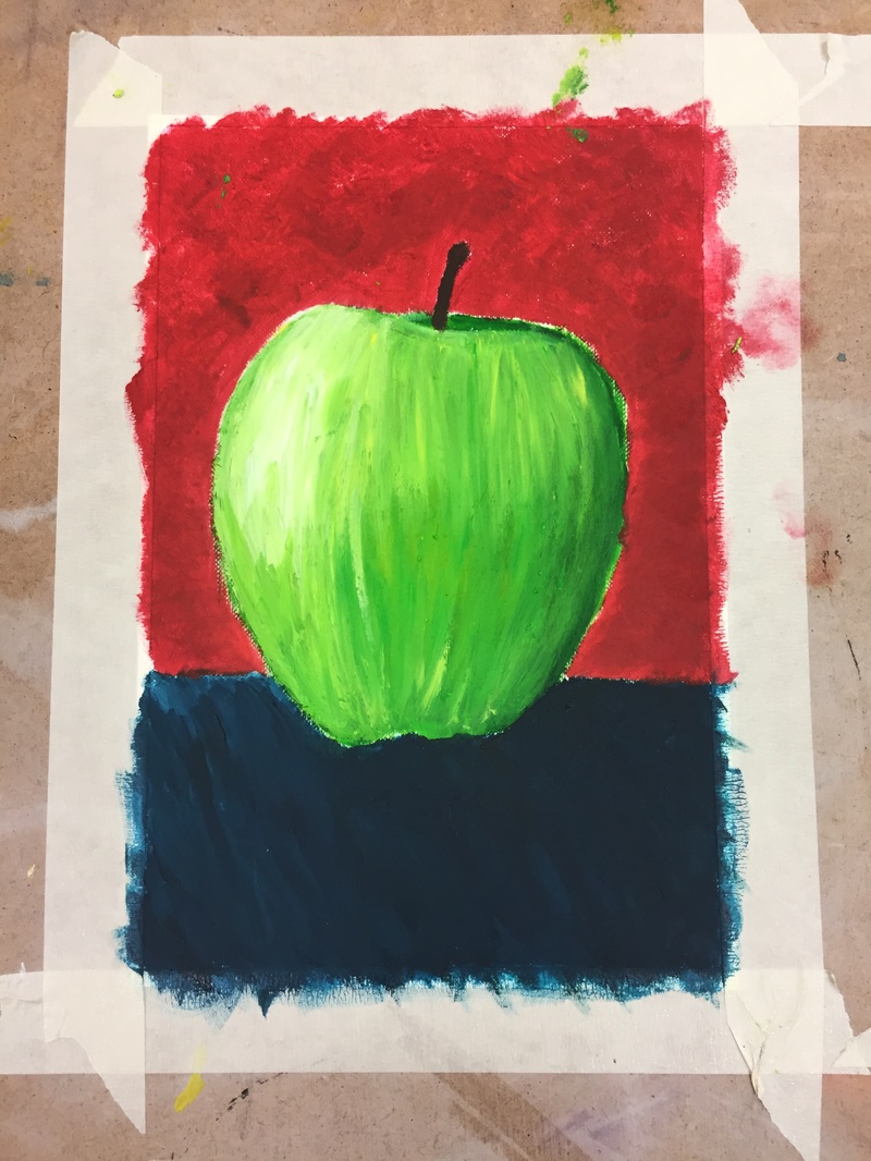
I really rushed this piece because I was more concerned with finishing my nature/mechanical piece so I only spent like two hours doing this. I really like the base of the gum ball machine and l really loved drawing the gum balls. That was my favorite part. I didn't do as nearly as many gumballs in the picture and l didn't do any gum balls in the jar itself. I plan on going back and adding some gum balls to that to make it seem complete. I love all the reds l used to make the red base and l used dark browns to give it even more dimension and shading. I found that l enjoy working with red the most. Idk why but its just my favorite color to use. l really loved drawing the gum balls. l just love drawing circles and the red and blue gumballs are my favorite.
0 Comments
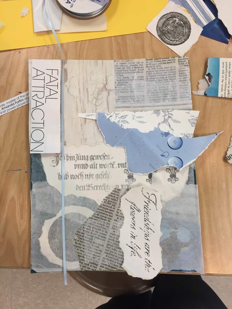
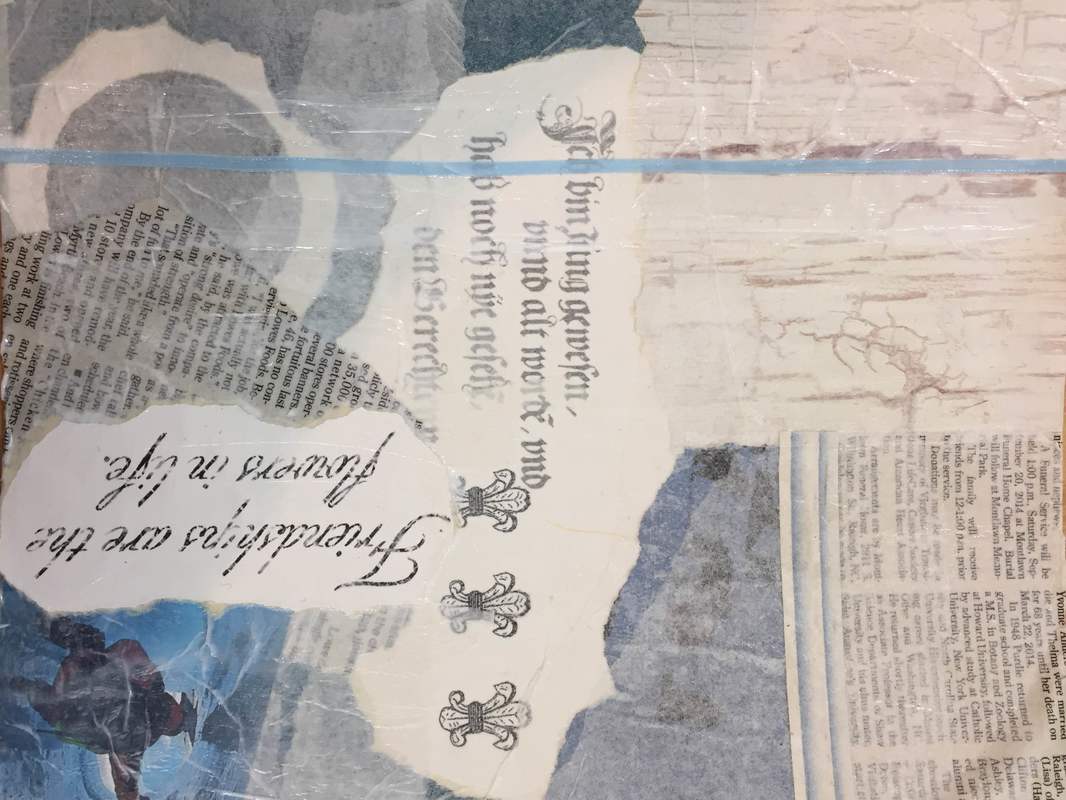
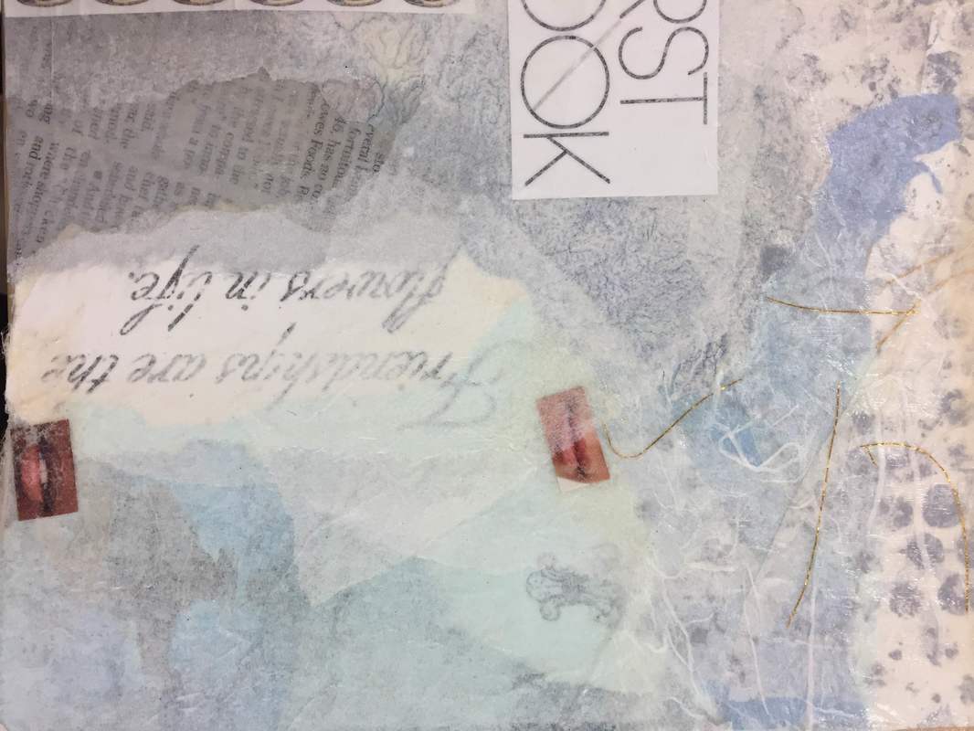
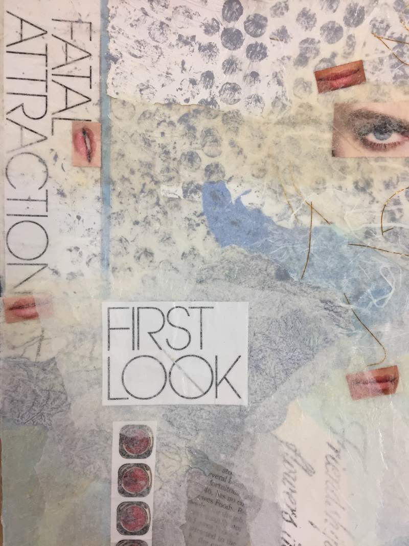
This project was a lot of fun. It was all trial and error and Mrs. Rossi had to help me out at first. It was very crafty which is a lot of fun and our whole table basically had the same color scheme without even trying which is funny. I really like how the eyes look and I would like to go back and make the eyes and lips melt into the rest of the piece. My favorite part would be the righting and I really like the look of the bubble wrap used as stamps. I think it would also be cool if l gave it a more industrial look. Like add some metal and like metal spray paint maybe some gears.
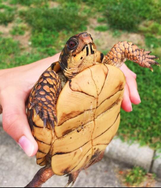
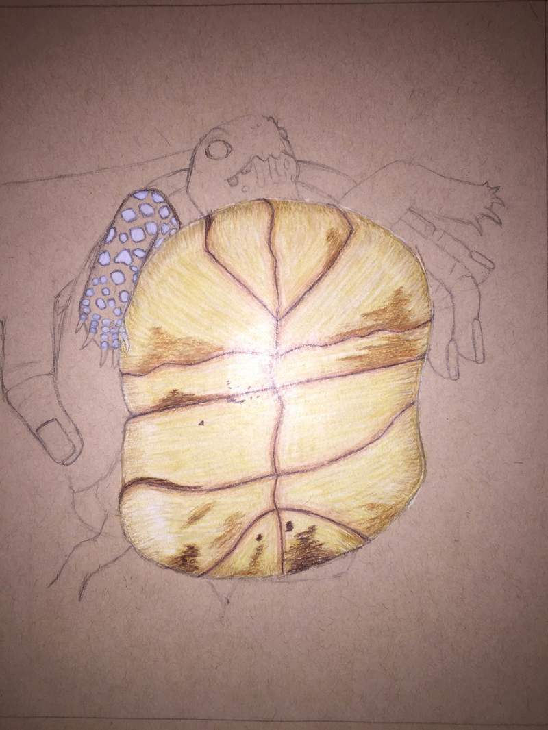
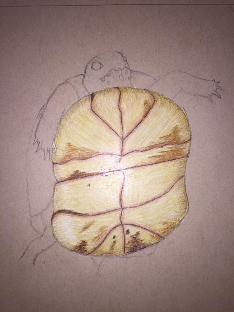
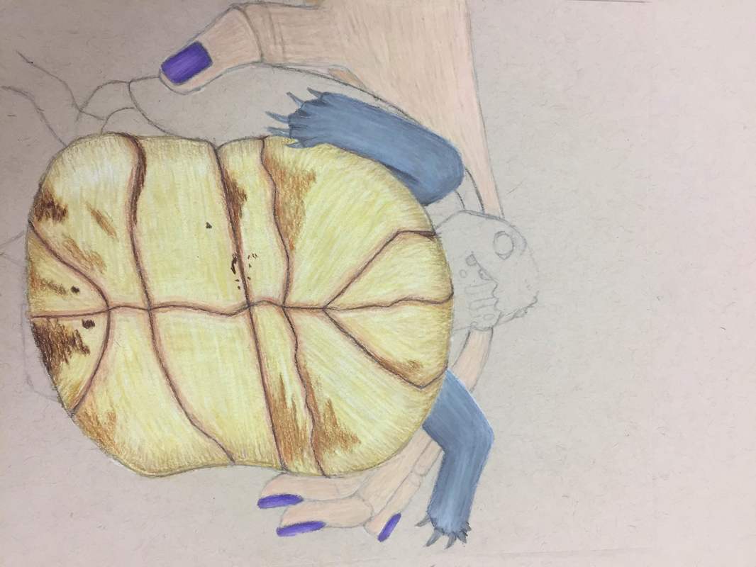
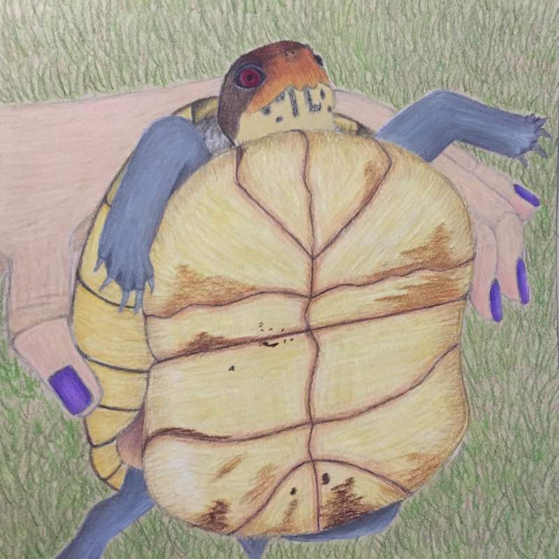
So I started out strong with this piece then I lost motivation(senioritis is a struggle) but I feel like I ended strong. This is one of my top three favorites and i'll probably submit this piece along with the jar and animal pieces. I think this piece is really cool because I rescued this turtle from the street and I just love turtles. Idk if you can tell but the arms and legs are supposed to be like mechanical but i'm not very good at drawing metal. The turtle shell and head are my favorite parts about this piece and these are where I did the best at with drawing. I feel like i've gotten really good at using prismas(not sarah and tess good but really good) and i've learned that the key is to use a lot of different colors and colors you don't actually see in the picture.
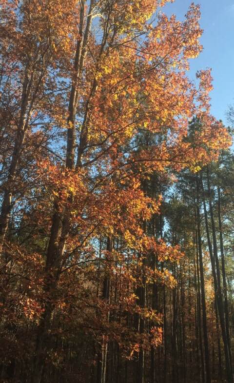
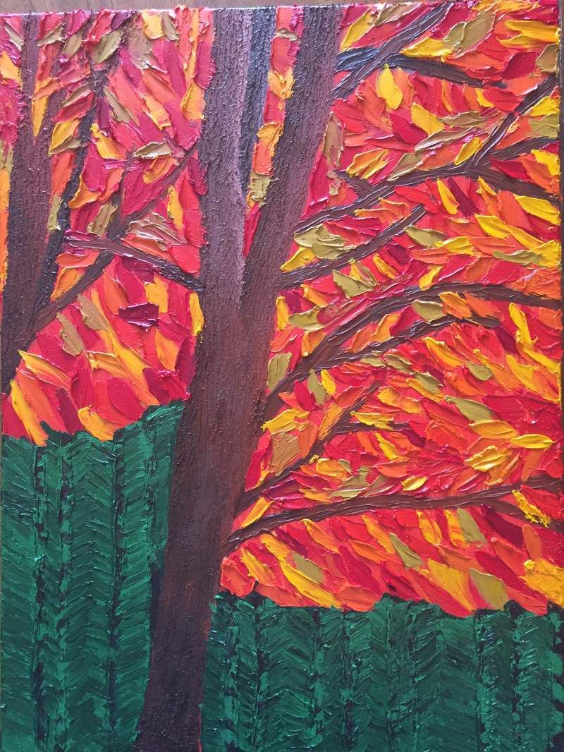
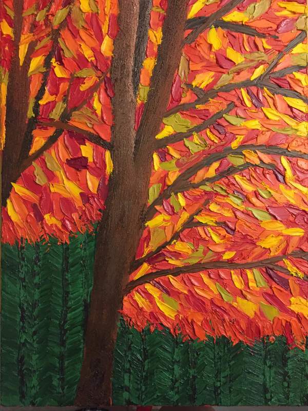
I really do not like this one. I had a picture in my head of what I wanted it to be and it just didn't turn out at all like what I was going for. And I hate painting. I do like the tree trunks a lot. I got really good shading and highlighting and they have a really cool texture to them. I just want to run my fingers up and down them. I used a bunch of different browns for the trunks. I also used a bunch of different yellows and reds for the leaves and they have a cool texture to them too. Other than that I really dont like this painting.
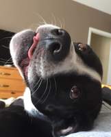
So this is my animal project. While working on this piece I noticed that I have really improved on my use of prismacolors. My favorite part about this piece would be my dog's eyes. In my progress picture you can see where I was practicing drawing the eyes. Drawing dog eyes is very hard. My problem with drawing them was that is had to blend the black into the golden yellow color of her eyes because thats how her eyes are. It was tricky because I had to go very slow and careful in order to not oveddue the black and have it take over her eyes. The eyes are my favorite part about this piece. Im just so pleased with how they turned out in the end.
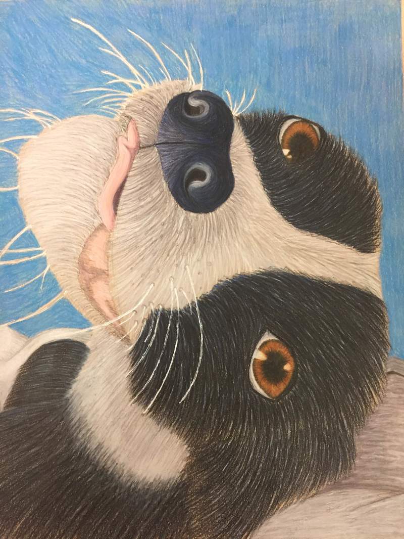
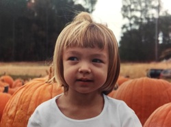
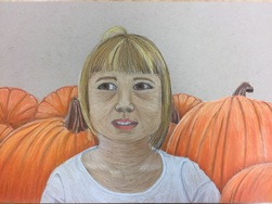
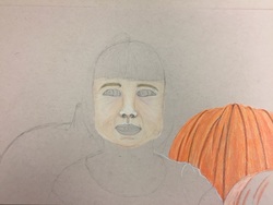
So I started this piece by starting on the nose. I went a little out of my comfort zone and I used alot of purples and blues. I used just a little bit of black to make her nose a tad darker and I also used the black to show shawdows in her nose. I did the same with her fur. In the fur i used alot of greys and blues and I added a little bit of purple and black. For her lighter fur I used white and alot of different shades of greys and some browns. I probably could have added more shawdows and more shades of pink to her tongue to give it more demensions. Her mouth was probably the hardest part in this piece and I didnt really want to do it and I feel like it shows that. I also feel like i made her "chin" to big for the rest of her face but oh well. Another hard part was the background. I didnt really know how to draw the bedding and my dog sort of melted into the bedding so it was hard to tell which was the dog and which was the bedding in the picture. And I didnt want to draw the dresser and the tv so I just made the background blue. I would like to go back and make it a darker blue. So this is the picture I used for my self portrait project. This was my first self portrait drawing and my first time drawing a completed face in general. I skipped drawing and Art 3 so I never had the chance to make a self portrait and in Art 1 we drew parts of a human face but never a completed or whole face. So this project was pretty intimidating. Mrs. Rossi really helped me when drawing the face. I wanted to draw my face how I saw it in the picture which is the wrong way to do it. The key to drawing faces is to draw it as an egg shape and then go back and make changes to your egghead to make it resemble you. Another problem I had was with my nose. Noses are very hard to draw and sketch out and they are hard to shade to make it look like a nose. With my face I started at with too light of a shade for my skin tone. I was also scared to use too much brown because I didn't want to make my skin too dark but I needed brown to make my skin look like me and the brown was essential for my skin tone because I have a darker skin tone. My hair was another challenge for me. I've never done hair before and I looked up videos on how to draw hair and I just couldn't get the volume and dimensions of the hair like in the videos. I don't really know what to do with the hair but I'm going to keep working on it and hopefully it gets better. I'll probably ask Sarah or Tess for help on how they draw hair. I also need to add more layers of white and different shades of grey to my shirt. As I'm writing this I'm looking at my original picture and the drawing of what I have done and I need to go back and darken my eyes and make more shading in the eye area. And I need to continue working on my face and adding more highlights and shadows and maybe adding like a blue or a purple to the shadows. I am very happy with my pumpkins. The one in the bottom right was my like tryout pumpkin and it's ok but they got better as I kept going and I really like how they look. I think the hardest part is going to be drawing the the trees in the background because it is a bunch of shadows and highlights. I've started on working on it and so far I'm feeling confident about the trees so that's good!
I feel like I have gotten a lot better with using prisma colors. My favorite part about this piece would be the railings. I just love how they turned out and all the highlights and shadows I have on them. Drawing the bricks was very hard and time consuming. However I like the bricks at the top of the wall better than the ones used for the archway. I think the yellow walls turned out nicely too. There is a lot is still need to do to this piece like adding more shadows, drawing the space behind the brick walk way and adding to the color of the floor to mute the cool grey blue tone. Personally I feel like this piece is a step up from my last prisma piece, I just need to finish it. The bricks were a challenge, there were so many of the bricks and thy were very tiny and detailed oriented. This is my ink monster. This was also my first time using ink.The process of using ink and a straw was a lot of fun to do. I enjoyed the hands om process of creating my monster and watching daily monster was very entertaining too. This activity was a fun way to bond with my men-tee while still being productive and learning new techniques.  Well this is my everyday object project. This was my fist time using oil paints and I really like them. I like oils a lot more than acrylics. I don't know why but they just feel better to use rather than acrylics. So I started this project by using a brush but I got impatient with the brush so I switched my technique to use a pallet knife. I really loathed drawing a painting the second cup. For some reason when I was drawing it I just couldn't draw it they way I wanted it to look and painting it was the same way. Then I forgot to draw the handle for the cup. I tried to mix up the color scheme from the original picture so I made the background blue but I didn't like how that looked so I went with the original color scheme in the end. I would probably change the granite. It is black in the picture but in my painting it was just too much black too fast and I feel like there is no depth or dimension in the piece. Maybe I'll go back and add some red to the granite like Mrs. Rossi said and maybe some lighter tones like white or maybe a light blue. i also want to add some darker shades of brown to the left side to add more depth because it doesn't look as good as it did in my garage at 11 O'clock on Thursday night. But overall for my first time using oil paints I feel like a did a pretty decent job and I want to use oils again for a future project. Next time I hope it will turn out better than this project and the next time I'll use brushes and see how it turns out that way. This was my first time using oil paints. I really enjoyed painting with them even though I had a hard time making shadows and the highlights were sorta hard to do too because the paints blend so easily. Although they do blend easily I do love working with the paints and how they feel to paint with. The class paints did not feel the best to use. They were goopy and hard to spread and paint with but the paints I ordered off of amazon were nothing like the class paints. They felt fluid and easy to work with. As of right now i enjoy using the oil paints so much more than acrylics. I just feel like the overall outcome is much better when using oils vs acrylics. And oils are so much faster to use so it doesn't take so long to do a painting I feel like. |
AuthorWrite something about yourself. No need to be fancy, just an overview. ArchivesCategories |

 RSS Feed
