|
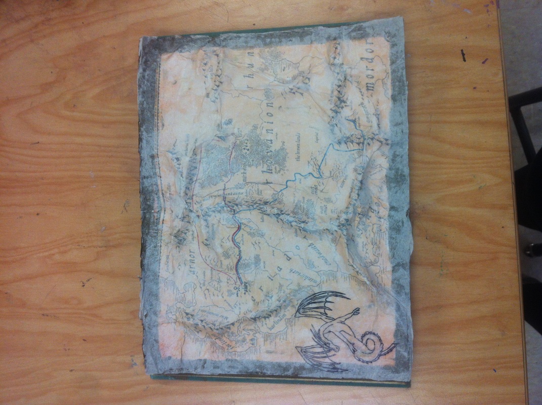
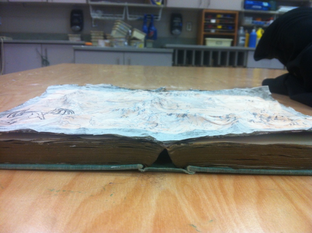
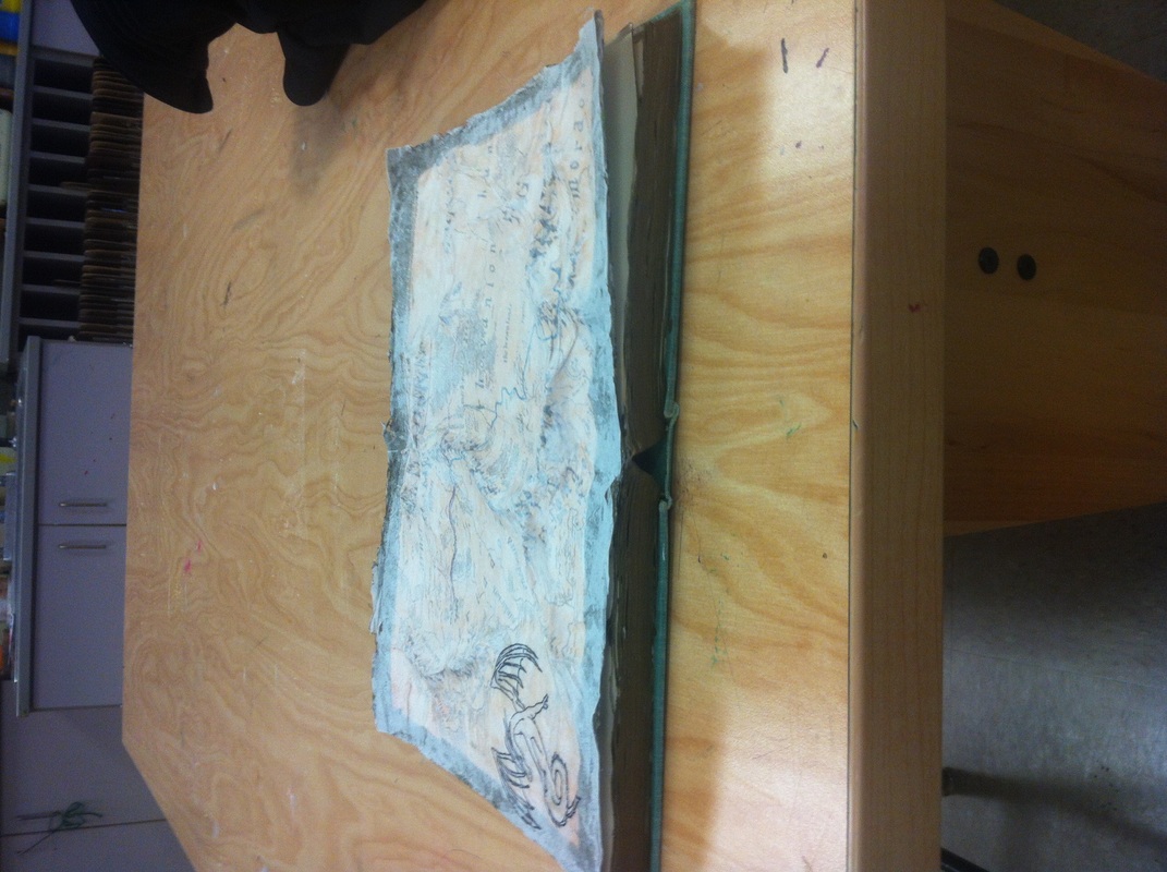
For this project i based it off of The Lord of the Rings. I really liked the look of old maps so i printed some pictures of those and i layered them with tissue paper to give it texture. I then printed out one big map of Middle Earth. I sketched out where the mountains would be and i used newspaper to make the mountains in the picture raised. I then put a gold border around the map and on the sides of the pages of the book. When that was dried i decided to draw a dragon in one of the corners to add something more to it and because there was a dragon in one of the books.
0 Comments
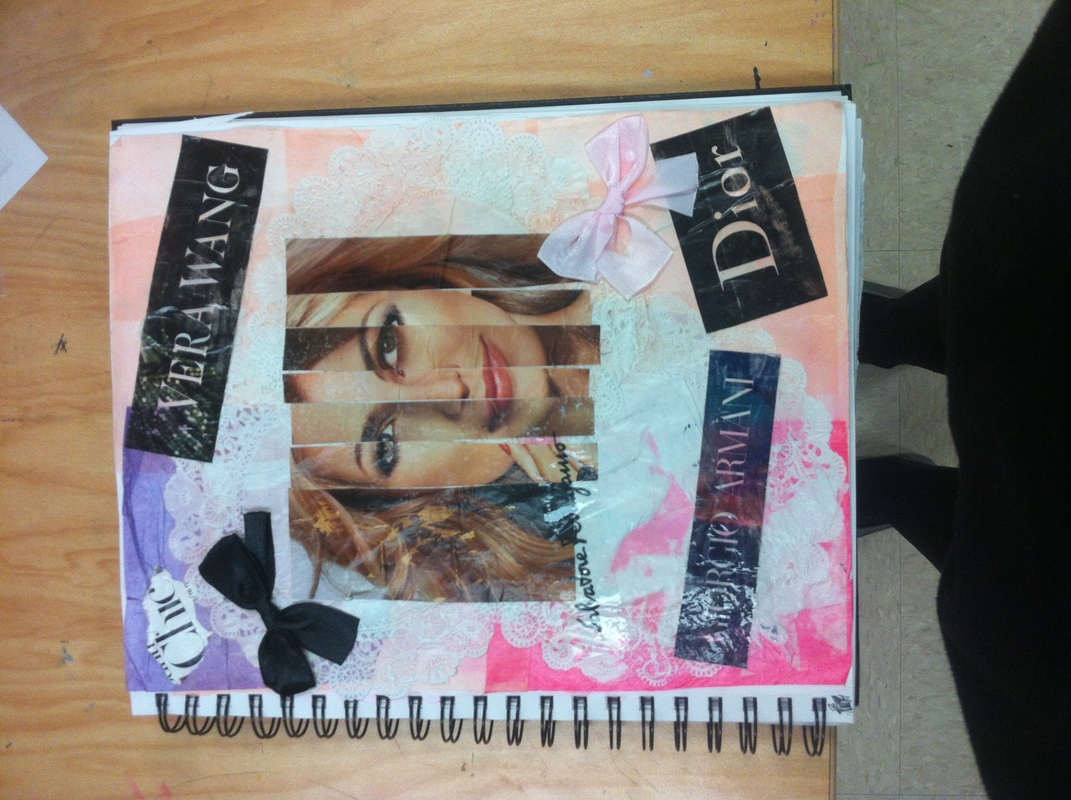
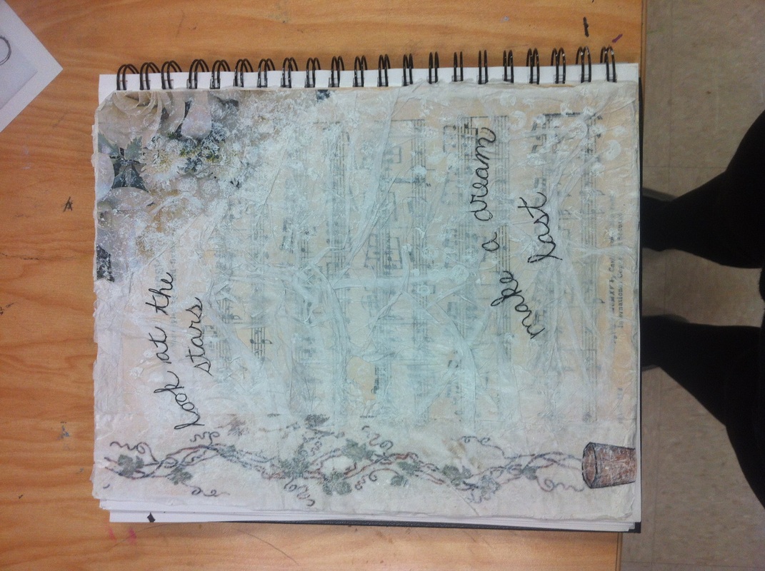
For these two pictures we had to capture a topic or an emotion we were feeling and make it into art. I liked my second picture better because i had finally gotten the hang of this project and i had a better idea of what i was feeling and how i wanted to make it look. For this journal i picked the subject beauty. I didnt really know where i was going with this. I was trying to incorporate big names in beauty. i dont really like how it turned out and i should have had a better image of where i wanted this to go. For this journal i had a clearer picture of what i wanted and the color scheme of it. I really love the faded sheet music in the background and the vine that is crawling up the side of the paper. That day i was really getting into my music and thats what i based this journal off of. i really just love how it turned out and i couldnt be happier with it.
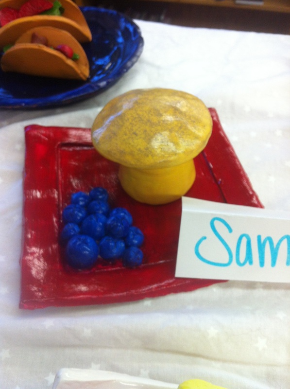
For this project we had to make a sculpture and i really struggled with this project because im not good at sculpting. I really do not like the way the muffin turned out or the plate. Overall i do not like this project. I do not like the way it turned out and i just tried to rush through this project. If i would have taken more time and tried harder for this project i probably would have liked the outcome alot better.
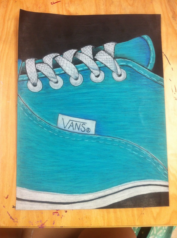
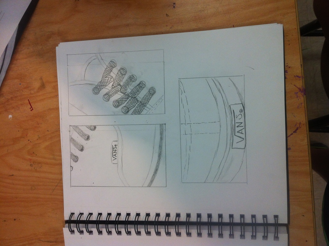
I am really happy with how my vans turned out. I put alot of time into this project because I really wanted this one to turn out good. i love the shading and the contrast of the shoe. The shoe laces were my favorite part of the shoe. I really like how they just pop off of the shoes and i really like the shading behind the laces too. I feel like this is my best project. This was my favorite and my best project and i really love the way it turned out. This artwork is original because i used pictures of my own shoes and i made it my own. The sketches were of my shoes too. For this project i used colored pencils because i wanted to challenge myself and im really happy with the outcome.
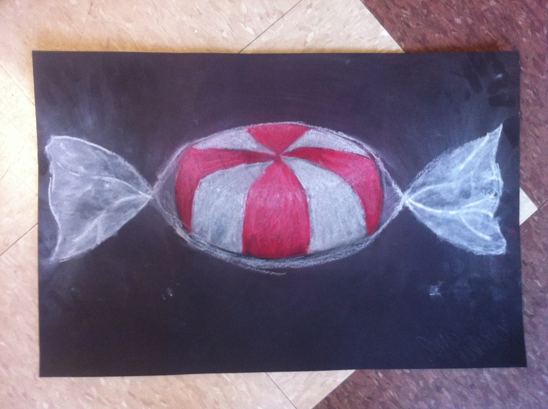
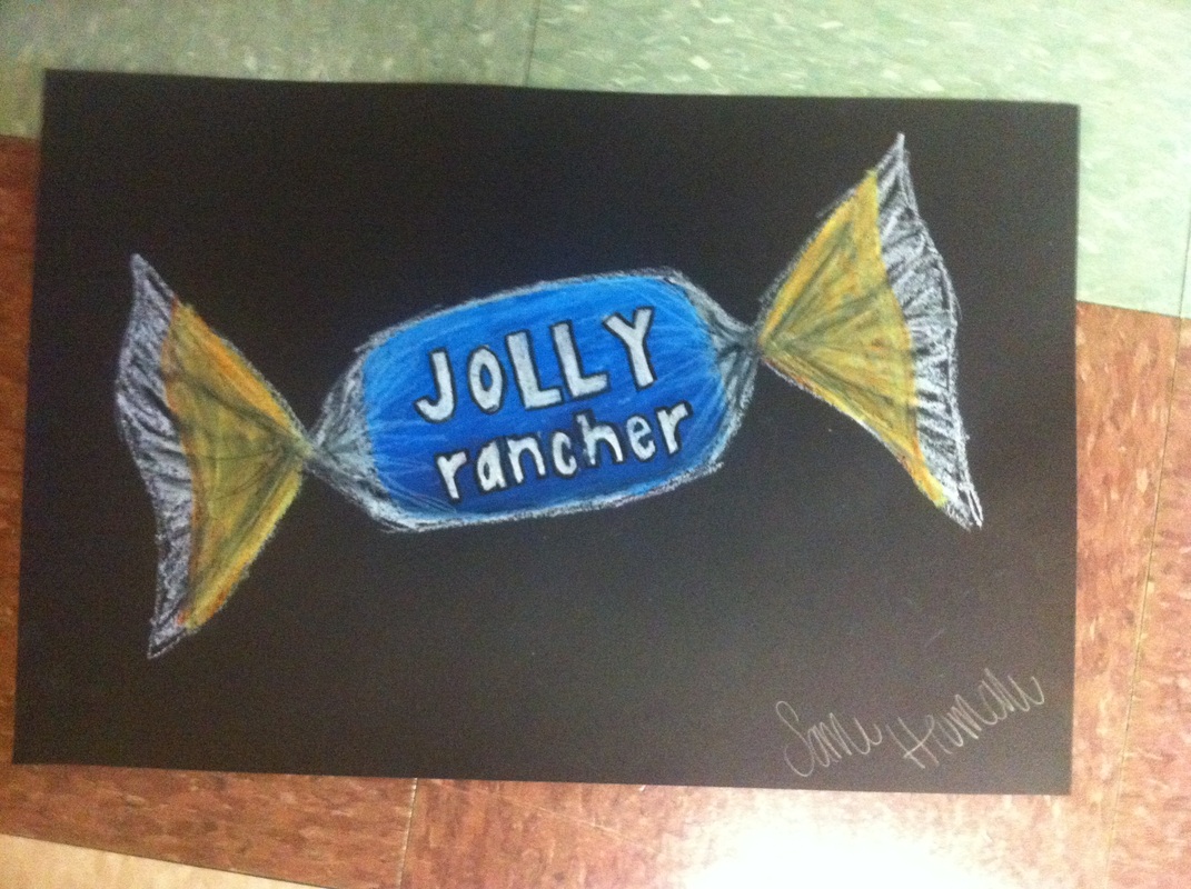
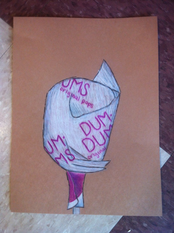
For this project we had to make three different drawings of candy. for the first drawing we drew a peppermint with chalk. I really like working with chalk because they are easy to blend with. You can also show the highlights and the shading. this was my favorite of the three candy drawings. I feel like this was my best one out of the three. The chalk moves easily and i just feel like its easier to use out of the oil pastels and the colored pencils. For this drawing we used oil pastel. The oil pastels were hard because it was easy to ever blend them and then the colors would not blend. I like the blending with the candy, but im not really happy with the wrapper of the jolly rancher. I could have taken more time to draw the wrapper. For our last drawing we drew a dum dum. i am not really happy with the way it turned out. i had a hard time with the shading and highlights and this is really just my least favorite drawing. For this drawing we used colored pencil. This was the hardest to use because you really had to layer it up and and you had to be careful not to use to much of the dark colors.
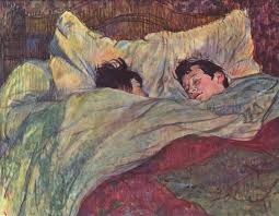
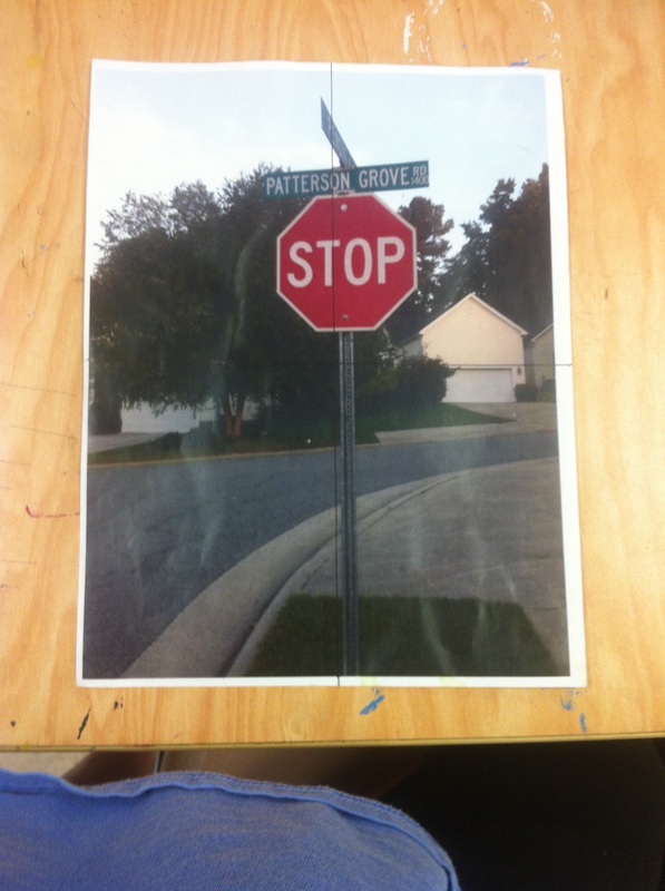
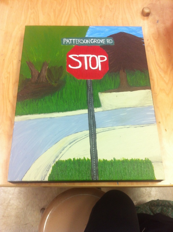
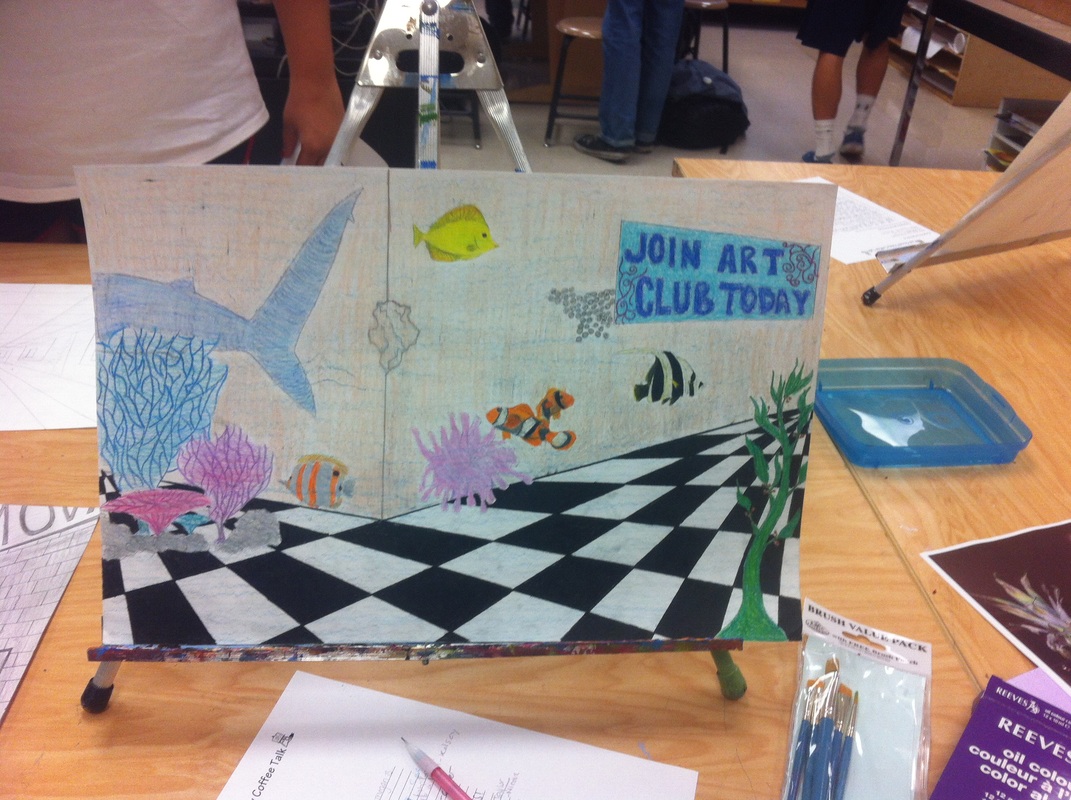
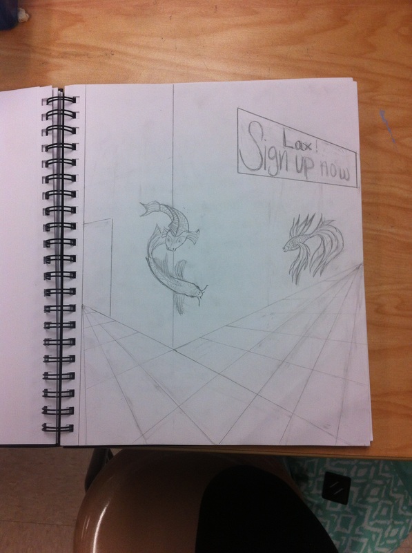
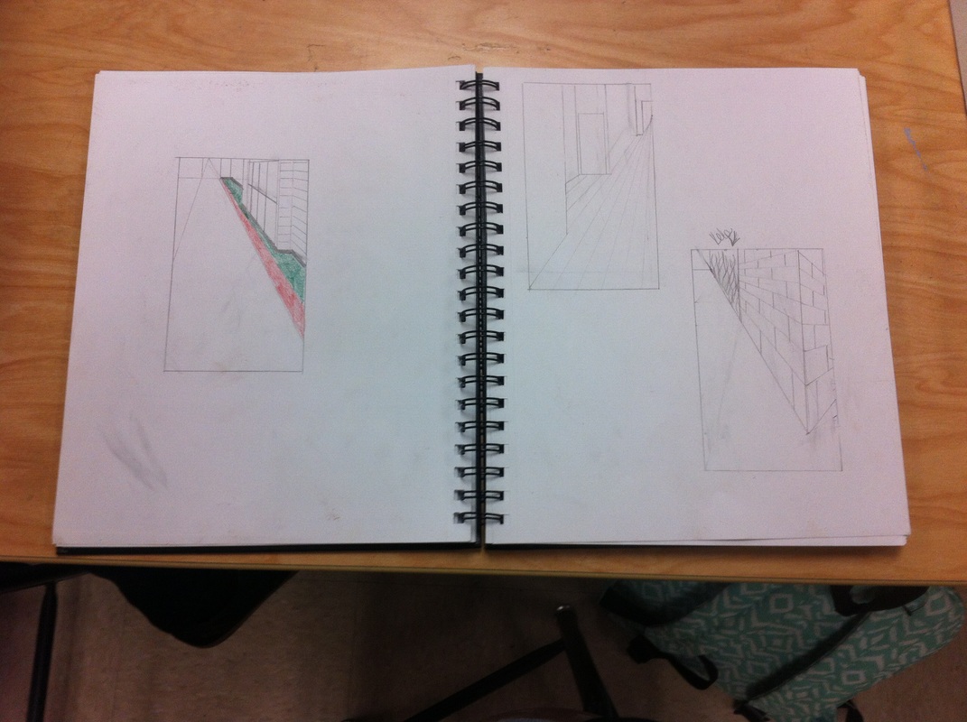
For this project we worked with acrilic paints and they were somewhat hard to use because 1. you had to mix your own colors and 2. the tended to dry fast so it was hard to blend with the already dried paint. For the project my artist that i picked was Henru de Toulouse-Lautrec. He was part of the the post-impressionist era along side some of the best known artists of that era. He mostly painted women, people in their natural working habitat, and he also painted posters. He used long thin brush strokes and i tried to show this in my work. At first i wanted to paint my cousin but the picture had alot of little details and i was having a hard time so i decided to paint my stop sign. In my painting i added some details and left some out. On my painting i tried my best on trying to mimic his painting style and his brush strokes. My painting isnt exactly as skilled as his but i think it looks pretty good and believe that my brush strokes are pretty close to looking like his. for this project i developed my art making skills. this was my first project were i was using the prisma colored pencils. they blend alot easier then regular colored pencils and they look alot better so my artwork had better use of colors. i decided to do a school setting because i was having a hard time trying to do a abandoned subway which was my first idea. it was easier to do a school hallway because i could take the pictures and visualize what i needed to do and how i wanted everything layed out on the paper. i feel like i did ok on this project. it wasnt one of my favorites because i am not that talented at drawing and i had a hard time trying to make it look like you were underwater, so i sorta just gave up on that part. i could have tried harder on some parts of this project but i am pretty happy on how the fish turned out and the coral. the coral was somewhat hard because i couldnt really get it to look realistic but i do feel that it is pretty close to looking realistic. i did have a hard time with the paper because it was staring to rip. |
Archives
January 2015
Categories
|


 RSS Feed
